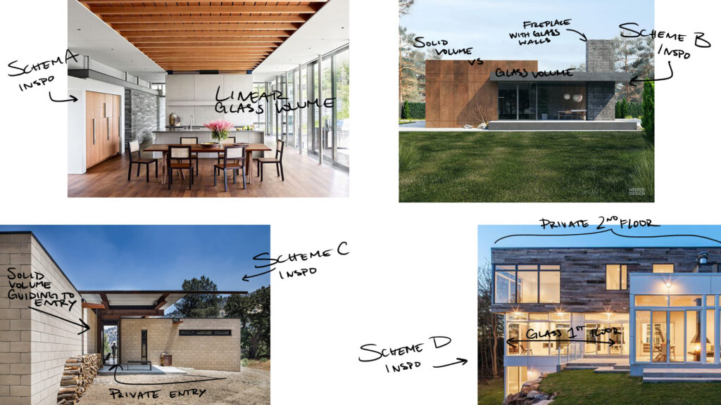
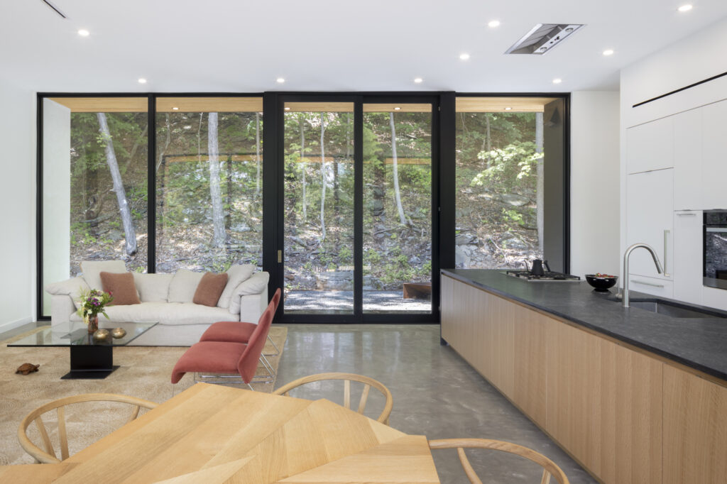
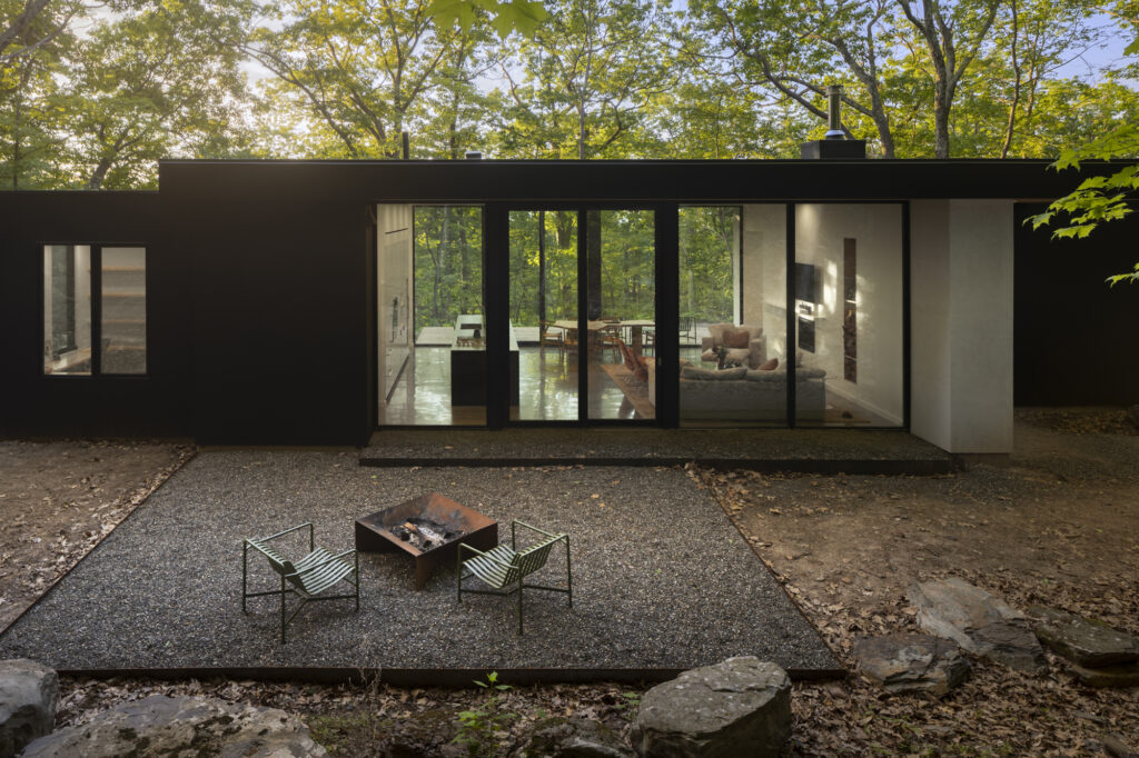
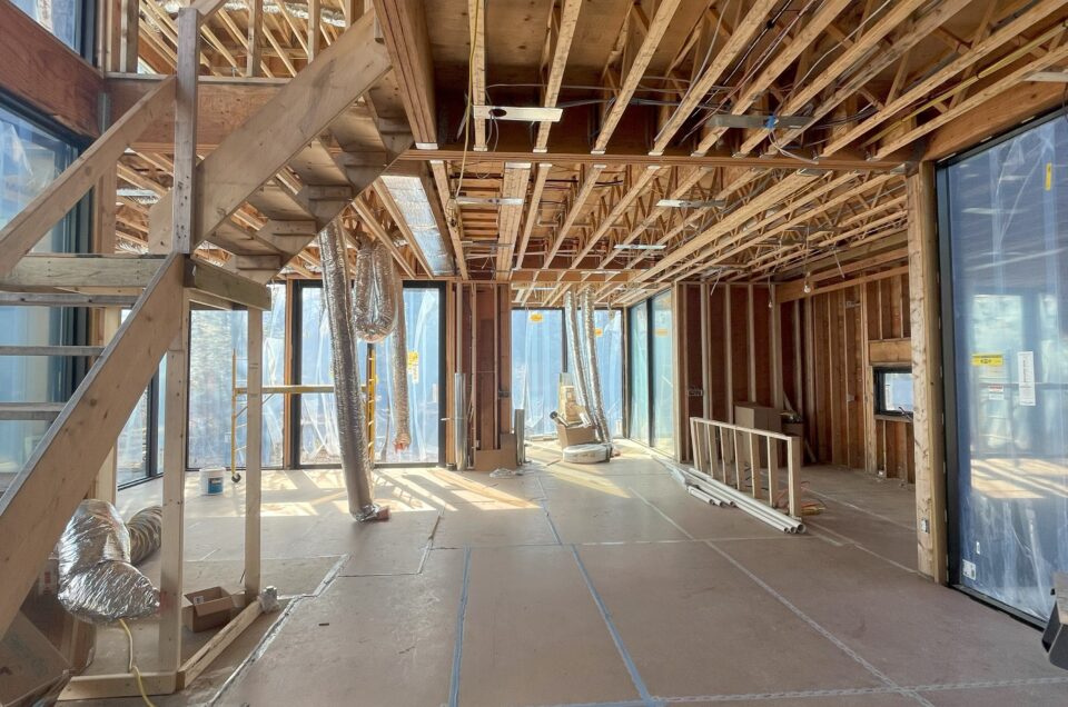
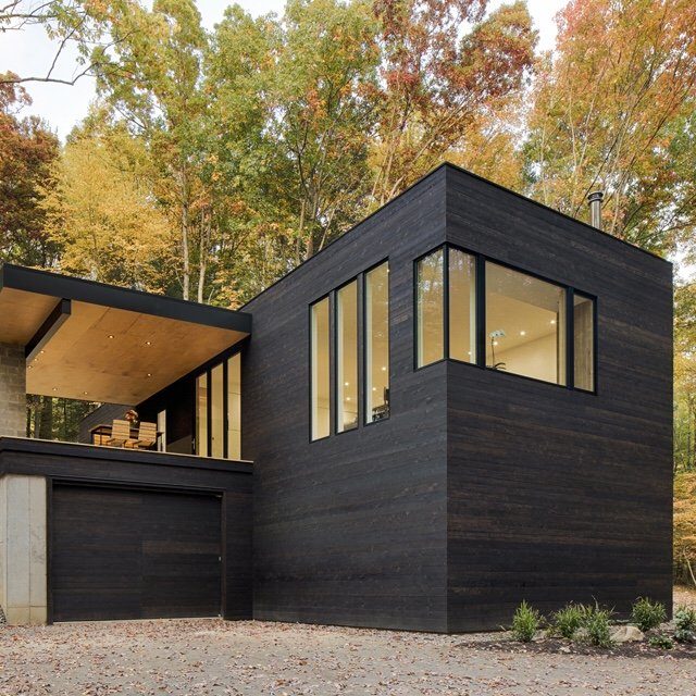
Kaat Cliffs, one of our recently completed homes, was designed with the inspiration of Philip Johnson’s iconic Glass House. Our clients’ love for this home was considered in the design for the public living area. As Studio MM pulled inspiration images for their first four schemes, they carried the language of floor to ceiling glass windows in the living room throughout all of the schemes. Let’s take a look at how they got to our final glass living area design.
Design and Craft: Kaat Cliffs Glass Living Area
Inspiration
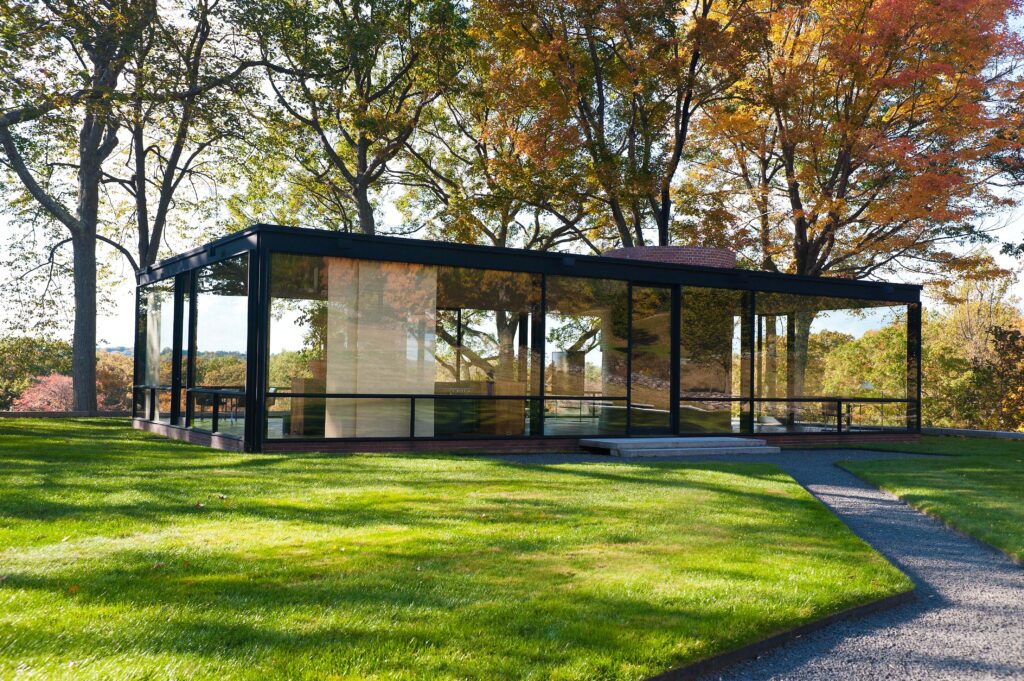
Philip Johnson’s Glass House’s exterior is entirely made of glass. Looking in, there’s a cylindrical brick shape which encloses the bathroom. Pulling from these solid private vs see-through public spaces, the schemes were designed with private and public spaces playing with glass vs solid exteriors. All of the schemes experimented with this opacity vs transparency, yet differed in overall form.
Schematic Design
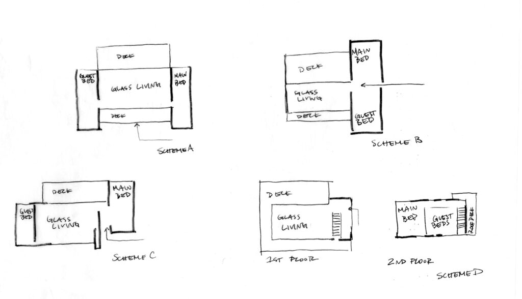
Scheme A consisted of two private (solid) volumes on either side framing the public living area. Scheme B was a T shape design with the glass living area directly through the entry sightline with the private spaces to the left and right, perpendicular to the glass volume. Featured in the glass living room, we designed a large stone fireplace that added a solid element to the three glass walls. Scheme C was similar to Scheme A in having two private spaces flanked on either side of the living area. However, Scheme C focused on the main bedroom volume extending past the rest of the home and having the guest volume in line with the living area creating an asymmetrical design and private entry. Lastly, Scheme D was the only two floor scheme, designed with a glass box first floor and a private second floor.
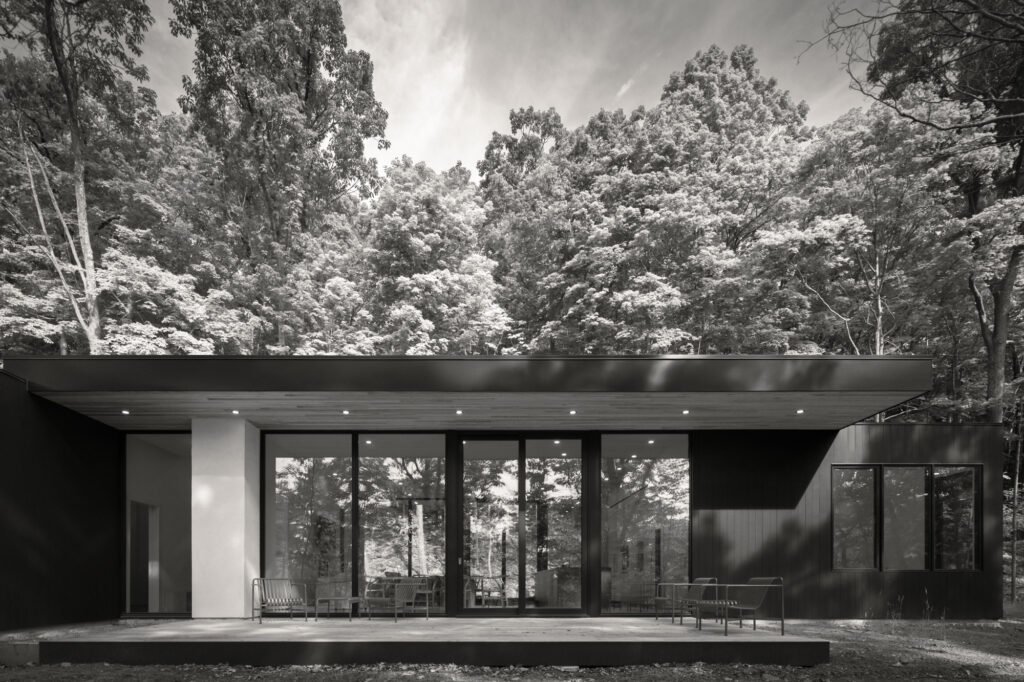
The client moved forward with Scheme C and added a gravel deck on the West side of the home to create a flow from exterior to interior to exterior. Having two exterior spaces emphasizes the glass box design and the ability to see through both sides of the home and creates distinct experiences on each side with neither overpowering the other. Utilizing the spaces outside of both glass walls emphasizes the beauty and enrichment of having access (visible and physical) to both exterior spaces.
Design Development
Next, Studio MM focused on materials, finishes, appliances, and fixtures for the living area. With the goal of a connection to family and the Hudson Valley community, our client had a custom table designed by her aunt to be built by Braxton Alexander. Braxton has worked on a few of our projects including the table at Cat Hill. In addition to the table, the stucco walls were hand troweled by her sister. Personalized to our client’s daily routine, a single seat at the island is dedicated to her time reading the paper in the morning. Bringing these personalized moments into the living area has created an intimate and cozy interior inside a see-through public space.
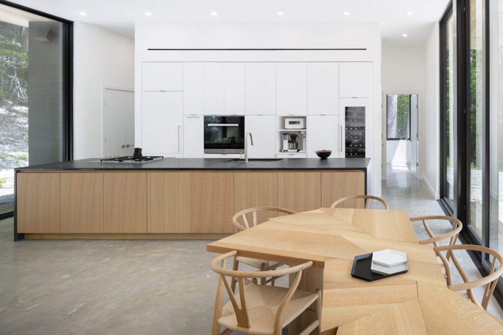
custom dining table designed by our client’s aunt and built by Braxton Alexander
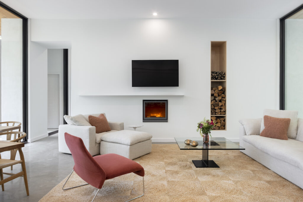
Fireplace that brings coziness to the space
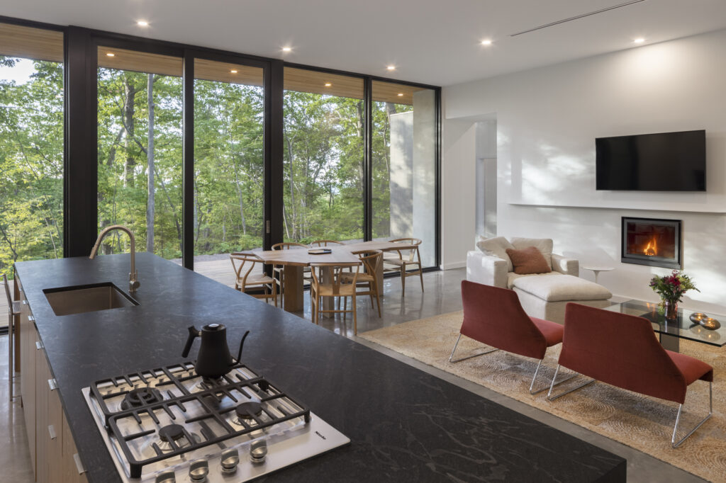
single chair for reading at the corner of the kitchen island
To learn more about the design and to see all of our final photos of Kaat Cliffs please visit our other blog post, Presenting Kaat Cliffs.




Leave a reply